Most include a sign linked to music, Eg; a microphone

Sony have a very simple red swish of a paintbrush.

Many logos include musical notes.

 I quite like this one as it is very simple and changed colour, putting more emphasis on the word "tune".
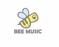
These two logos are very interesing, the image of a bee symbolises not only links to the name of the company but implies fun and summertime. The image of fire and the disk is eyecatching and suggests a liveliness and an energy to the company.

How Has This Research Influenced My Planning:
1. Needs to be eyecatching
2. Reflect the name
3. Needs to be symbolic
4. Needs to suggest something youthful and lively
You still need to sort out the presentaiton of this post. Perhaps copy and paste it into word and then back again
ReplyDelete