
Monday, 29 January 2018
Friday, 26 January 2018

Thursday, 25 January 2018


Research TA 5 Focus Group of 14 - Rough Cut 2 (Group Post)
Music Video Target Audience Research 5: Rough Cut 2
1] Do you understand the narrative of the music
video?
Preferred encoded reading achieved: 11 said yes
Negotiated reading: 1 said slightly
oppositional reading: 2 did not understand it but they didn't explain why so it doesn't help us
Action: check the timeline for any shots that may make the narrative confusing. Possibly conduct a smaller focus group. Ensure that I ask why. Many said "the signs" helped so we may be able to insert a close up of a sign elsewhere.
2] Do you think the
video is clearly of the pop genre?
Preferred encoded reading achieved: 13 said yes
Negotiated reading: 1 said "yes but we used too many nature shots for a pop genre
Action: crop one or two of the nature shots so the frame is more dominantly the star image. see if we have any other shots of him in an urban location.
Preferred encoded reading achieved: 13 said yes
Negotiated reading: 1 said "yes but we used too many nature shots for a pop genre
Action: crop one or two of the nature shots so the frame is more dominantly the star image. see if we have any other shots of him in an urban location.
Preferred encoded reading achieved: 11 said yes. The brighter colours were more recognisable and memorable.
Negotiated reading: 1 said slightly. All casual and normal clothes used.
oppositional reading: 2 said they weren't too different and need to be more colourful to suit the genre.
Action: Put effects onto shots where relevant.
Preferred encoded reading achieved: 8 said yes. "the one in the town was very effective - working with lyrics at all times". They all liked the town and countryside shots.
Negotiated reading: 4 said slightly. All said they liked the field and town although they didn't quite understand the concept of the field with the narrative.
oppositional reading: 2 did not understand it. They thought the nature shots didn't work well and we should use less of them. Also the locations look out of place.
Action: find more town shots
Preferred encoded reading achieved: 10 said yes. All said they worked really well
Negotiated reading: 4 said slightly. 3 said they could hear the audio in the background and 1 said "I think you may be a little literal.
oppositional reading: non
Action: No action needed as we will be detaching and deleting the sound
Preferred encoded reading achieved: 14 said yes. Favourite shots: 3 = slow motion jump
1= love heart
2= fire
2= you, you, you
6= change of costume in field when he hits camera away and comes back
Negotiated reading: non
oppositional reading: non
Action: No action needed
Preferred encoded reading achieved: 4 that liked them all.
Negotiated reading: non
oppositional reading: 2 = mirror shot, 2 = spinning round lamp post, 4 = running in field, 2= opening shot
Action: could change running in field to heart action as its symbolic. Also check opening.
Preferred encoded reading achieved: 7= happiness and love, 4= happy, fun, free spirited, youth
Negotiated reading: 1 said representations of pop music linked to towns
oppositional reading: non
Action: No action needed
9] Does this music video launch the male singer as
a new star? Would this video make you look online for more information about
him? Do you like him?
Preferred encoded reading achieved: 9 said yes
Negotiated reading: 2 with no answers
oppositional reading: 3. "No, it’s catchy but doesn’t define the singer as different or optional".
Action: Add a few more close ups either by cropping, Ken Burns etc.
How this research will influence our production
Action 1: check the timeline for any shots that may make the narrative confusing. Possibly conduct a smaller focus group. Ensure that I ask why. Many said "the signs" helped so we may be able to insert a close up of a sign elsewhere.
Action 2: crop one or two of the nature shots so the frame is more dominantly the star image. see if we have any other shots of him in an urban location.
Action 3: Put effects onto shots where relevant.
Action 4: find more town shots
Action 5: No action needed as we will be detaching and deleting the sound
Action 6: No action needed
Action 7: could change running in field to heart action as its symbolic. Also check opening.
Action 8: No action needed
Action 9: Add a few more close ups either by cropping, Ken Burns etc.
Research: Target Audience 6 on Advert Draft 4 (group post)
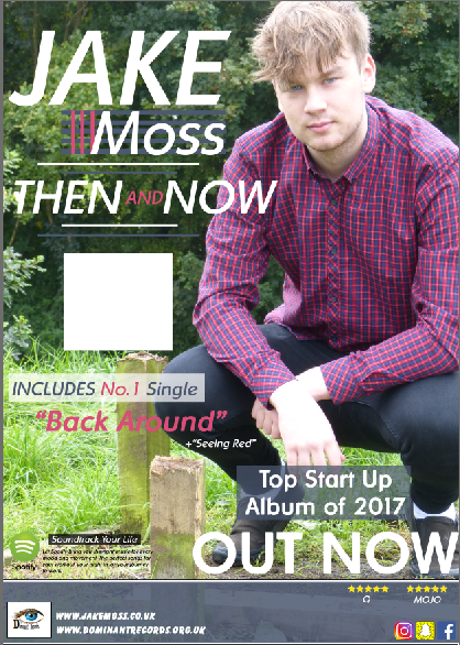
We asked a few members of our sixth form if they preferred a pink, purple or see through banner for the advert.
(Female 17) - "I would like a vibrant colour with a slight
see through aspect to it."
(Male 17) "I like the pink colour because it links well
with his shirt and the text on the page."
(Female 17) "I think it would look good if you were to
change the opacity slightly just so you can see the rural visuals in the
background."
We also asked what they thought about the advert in general.
(Female 17) - "I really like how the colours all relate
really well. Only thing I would change is the size of the front cover."
(Male 17) - "The colour scheme is great and develops
the synergy well. his face seems quite bright, maybe you could edit the photo
slightly to tune down the lighting slightly."
(Female 17) - "There are many great parts of this
advert I really like. For example, the colour scheme and natural green background.
The only bit I don’t like is how large the front cover is and how bright the
banner is."
Research: Target Audience Final Video (Group Post)
We surveyed 11 people. 9 female 2 male.
1.Do you think the kicking of the gate is relevant?
Prefered encoded reading achieved: 3 said that it announces a dramatic entrance and shows he is angry and upset.
Negotiated reading: 4 said that it is confusing as he seems aggressive but the song isn't aggressive. They also said that it gives a negative view of the video although the video is good. He is also upset and angry
Oppositional reading: 4 said it is aggressive and the song is about love coming back and he is being aggressive.
1.Do you think the kicking of the gate is relevant?
Prefered encoded reading achieved: 3 said that it announces a dramatic entrance and shows he is angry and upset.
Negotiated reading: 4 said that it is confusing as he seems aggressive but the song isn't aggressive. They also said that it gives a negative view of the video although the video is good. He is also upset and angry
2. Does the artist portray the genre well?
Preferred reading: 11 said yes. "it follows the genre due to visuals and audio matching", "the dancing and goofy singing into camera represents love", "fun and upbeat", "he is enjoying what he is doing"
Negotiated reading: N/A
Oppositional reading: N/A
3. What do you understand about the story line?
Preferred reading: 6 said "he was in a relationship that didn't work and he misses her and wants her back", "he wants to spread love and positivity", "searching and questioning love, wants love to be spread and asking a previous partner to love him again", "wants to bring love back"
Negotiated reading: 5 said "more of a concept based video to a narrative", "not sure why the strangers are there", "is he upset because love is lost between him and someone else in the video"
Oppositional reading: N/A
4. Which shot do you like the most and why?
Preferred reading: 1"hand in the shape of a heart", 3"you, you, you", 3 "change of costume in field", 1"swinging around lamppost", 1 "walking back", 2 "pan of town"
Negotiated reading: N/A
Oppositional reading: N/A
5. Do you think there were the right amount of costume changes?
Preferred reading: 6 said "effective to the character", "if there were anymore it wouldn't be right", "fun and added nice depth", "there aren't too many which is good"
Negotiated reading: 2 said "simply but not necessary", "don't think it was needed, could have been different outfits"
Oppositional reading: 3 said "should have been more obvious as the outfits are similar", didn't grab attention as they were all similar", "had little effect"
6. Which colours do you think are prominent in the colour scheme?
Preferred reading: 2 Red, 6 Pink, 3 green, 4 neutral/ browns, 1 white, 4 black/ grey, 2 blue
Negotiated reading: N/A
Oppositional reading: N/A
7. What shots do you think symbolise this video?
Preferred reading: 1 "circling the lamp", 6 "holding up the signs" , 3 "hands making a heart", 2 "hand holding", 2 "singing into camera", 1 "artist center frame"
Negotiated reading: N/A
Oppositional reading: N/A
8. How well is the artist advertised in the video?
Preferred reading: 11 said "a positive person", "main focus", "advertised well as in almost every shot", "fun and quirky", "very well", " happy and bright", "enthusiastic and happy", " a loving person"
Negotiated reading: N/A
Oppositional reading: N/A
9. Do you understand what has happened in the main characters life?
Preferred reading: 6 said "he gets happier as he finds love", "relationship problems", "breakup, hurt feelings", "had love problems", "split with girlfriend and wants her back", "really wants love"
Negotiated reading: 2 said "lack of love or maybe a lot of anger?", "some suggest he is thinking about a girl, others he is thinking about love"
Oppositional reading: 3 said "no", "not really", "video seemed concept based", "bubble with Iona in not repeated so not clear enough"
10. Do you think when the artist changes emotions throughout the video it allows you to connect with him more?
Preferred reading: 2 said "we feel different emotions so more relateable"
Negotiated reading: 3 said "all the same although emotions shown makes it constant", "I thought he looked happy"
Oppositional reading: 6 said "I didn't see a shift in mood", "no obvious change although I connect with him more when he is having fun"
Negotiated reading: N/A
Oppositional reading: N/A
3. What do you understand about the story line?
Preferred reading: 6 said "he was in a relationship that didn't work and he misses her and wants her back", "he wants to spread love and positivity", "searching and questioning love, wants love to be spread and asking a previous partner to love him again", "wants to bring love back"
Negotiated reading: 5 said "more of a concept based video to a narrative", "not sure why the strangers are there", "is he upset because love is lost between him and someone else in the video"
Oppositional reading: N/A
4. Which shot do you like the most and why?
Preferred reading: 1"hand in the shape of a heart", 3"you, you, you", 3 "change of costume in field", 1"swinging around lamppost", 1 "walking back", 2 "pan of town"
Negotiated reading: N/A
Oppositional reading: N/A
5. Do you think there were the right amount of costume changes?
Preferred reading: 6 said "effective to the character", "if there were anymore it wouldn't be right", "fun and added nice depth", "there aren't too many which is good"
Negotiated reading: 2 said "simply but not necessary", "don't think it was needed, could have been different outfits"
Oppositional reading: 3 said "should have been more obvious as the outfits are similar", didn't grab attention as they were all similar", "had little effect"
6. Which colours do you think are prominent in the colour scheme?
Preferred reading: 2 Red, 6 Pink, 3 green, 4 neutral/ browns, 1 white, 4 black/ grey, 2 blue
Negotiated reading: N/A
Oppositional reading: N/A
7. What shots do you think symbolise this video?
Preferred reading: 1 "circling the lamp", 6 "holding up the signs" , 3 "hands making a heart", 2 "hand holding", 2 "singing into camera", 1 "artist center frame"
Negotiated reading: N/A
Oppositional reading: N/A
8. How well is the artist advertised in the video?
Preferred reading: 11 said "a positive person", "main focus", "advertised well as in almost every shot", "fun and quirky", "very well", " happy and bright", "enthusiastic and happy", " a loving person"
Negotiated reading: N/A
Oppositional reading: N/A
9. Do you understand what has happened in the main characters life?
Preferred reading: 6 said "he gets happier as he finds love", "relationship problems", "breakup, hurt feelings", "had love problems", "split with girlfriend and wants her back", "really wants love"
Negotiated reading: 2 said "lack of love or maybe a lot of anger?", "some suggest he is thinking about a girl, others he is thinking about love"
Oppositional reading: 3 said "no", "not really", "video seemed concept based", "bubble with Iona in not repeated so not clear enough"
10. Do you think when the artist changes emotions throughout the video it allows you to connect with him more?
Preferred reading: 2 said "we feel different emotions so more relateable"
Negotiated reading: 3 said "all the same although emotions shown makes it constant", "I thought he looked happy"
Oppositional reading: 6 said "I didn't see a shift in mood", "no obvious change although I connect with him more when he is having fun"
Research: Target Audience Ancilaries 1
We sat down and gave sticky lables to our class mates and they wrote down their opinion and thoughts on the digipak. They wrote in detail what they liked and didnt like.
They feel that; Digipak -
Front Cover: the image seems abit burnt out and his name seems too out of the way.
Action: We can do this by changing the brightness of the colour scheme as well as desaturate some of the colours so it makes the photo look abit darker. We will also Move the font to infront of him and make both "Jake" and "Moss" the same size font.
Back Cover: There is too much green, there is also no relation with the viewer and we need a barcode, price and font.
Action: To fit with what out audience has said we could develop a layer mask on the image and desaturate the green slightly to maintain his brightness as well as reducing the amount of green in the image. We will need to add the institutional details (price and barcode)
Left Cover: The image doesnt fit in the box and they dont like how close up the image is.
Action: We will get the image again and crop it perfectly to fit inside the box. The image coud be brought back abit.
Left Civer 2: The image of the hands doesnt fit in the box.
Action: We will change the sizings of the photo of the hands and make it fit perfectly inside.
Back Inside: Too green.
Action: we will bring out some of the colour and make the image less green.
Cover Inside:No connection between the image and the music video. Too similar with the back inside. Makes no connection with audience.
Action: Change the image and link it to another section of the music video.


Wednesday, 24 January 2018


Subscribe to:
Posts (Atom)
-
 https://www.youtube.com/watch?v=RgKAFK5djSk The establishing shot for this video is a long shot of a beach, this shot sets them init...
 -
Jake Moss will be walking to a bench, when sat on the bench he will take out a newspaper. Throughout the video he will be looking back on wo...
