We organised a meeting with our artist and spoke about what he will need to do when acting as the star of the music video. When we told him that he will need to sing into camera throughout the video, he felt abit awkward about it but he said he will do the best he can in order to help us with our work. In addition, we also spoke about ideas for the visuals and lrics links, costumes, makeup and props.
As our star is male, we had to make sure he was comfortable with wearing makeup. We clarified with him that there will not be too much makeup. He then replied with "If I dont look too feminine then I'm fine with makeup".
Olly Murs tends to wear jumpers, scarfs and jeans. As Connor and I are both male, costumes will be easier to find as we already have a wide range of masculine coloured scarfs and clothing. Connor was happy with bringing a variety of clothing to the video shoots and costume shoots.
Finally, we also presented him with some ideas for shots we have come up with for the music video. He likes them and is happy with acting with the ideas.
Friday 29 September 2017
Friday 22 September 2017
Planning: Organising Principle Photography
Media Photos
- Photographs or family in war (KENZA)
- Signs for people on paper (KENZA)
- Locations (ALEX)
- Photos of artist (ALEX/KENZA)
- Costumes (ALEX)
- Headphones (ALEX)
- Newspaper (KENZA)
- Photographs or family in war (KENZA)
- Signs for people on paper (KENZA)
- Locations (ALEX)
- Photos of artist (ALEX/KENZA)
- Costumes (ALEX)
- Headphones (ALEX)
- Newspaper (KENZA)
Plannning : Artists Name
After coming up with a range of ideas for the stars name that will work for our actor. We have chosen:
- JAKE MOSS
- JAKE MOSS
Planning: Beat Script (Group Post)
Jake Moss will be walking to a bench, when sat on the bench he will take out
a newspaper. Throughout the video he will be looking back on world disasters
and wars, relating them to the present day and other generations.
Shots we will include are; members of the public holding pieces of paper that say "Bring Love Back Around". We will show brand identity and intertextuality through the headphones and car manufacturers. We will link into the concept aspect through pictures of war veterans.
Jake Moss will walk away from the camera, as he music dies down. Walking away signifies that he has done all he can and now it is up to the audience to "bring love back around". To promote our artist we will need lots of CU and MCU to show our audience our artist.
Planning: Treatment
Name of song: "BACK AROUND"
Name of artist: Olly Murs
Name of actor: Connor Macmillan
Outline of Ideas
- Newspaper showing world disaster
- Headphone (brand identity)
- Performance, narrative and Concept
- World disasters: Turning world "back around"
into peace.
- Shot of dead town centre
- ASL changes as beat gets faster.
What Recourses will you need?
- Costumes: White, black, light blue, Hat, Scarf
- Makeup: Kenzas sorting makeup
- Props: Car, Newspapers, Paper, Photos, Headphones,
Justification of Ideas in Relation to Genre and Artist
- Modern fashionable clothes
- Singing, dance performance aspect.
- Breaking conventions of POP.
Tuesday 19 September 2017
Planning : Actors and a Star Image
We need a male, teenage actor for out video. The actor being
male would work better with the song we have picked as Olly Murs is a male
artist. As well as this, the teenage age for the actor would help attract my
target audience at a higher degree as people could relate to them.
Our actor in the music video will be our friend, Connor
MacMillan. We have chosen this actor as he has previous experiences performing
in shows. He is willing to dress up in outfits and costumes that we
choose for him, creating the star image. In addition, he would also
be willing to sing into camera. Fortunately, we are close friends with Connor,
meaning he is open to things that others might find awkward. Due
to his previous acting and music experiences, the level of acting
will be highly convincing and well done. Connor is a male 17 years old and also
attends Brigg sixth form. As we attend the same college it makes it a lot
easier to make plans when filming videos.
Planning : Target Audience Profiling
Alexander Sherratt's Slidely by Slidely Slideshow
When filming for this music video we will need to consider many different aspects as they could affect our audience in a negative way. For example; the weather and the time of day. As the Brigg area is rural the scenary and environment around us are perfect for an Olly Murs music video.
In our music video we will target ages 14 to 26 as they are the existing audience of Olly Murs and also use social media a lot more often than others. We could use the popularity in social media to promote our artist by making Facebook and Twitter accounts linked to the star. we could also share videos on this account and create a social following for our star. Our video will target both male and female genders as it will increase the total audience size. Hopefully before filming we could find female background actors as it would mean we would be using both genders in the music video. our music video would also be targeting young aspiring singers and artists due to our artist being a young teenage upcoming star. The young aspirers could personally relate to our star. As we are targeting young teens for our target audience, it is providing a diversion for them to escape reality.
Monday 18 September 2017
Possible problem with copy right

To prevent this from happening to us, an email will be sent to the Sony Music asking for permission to use the song in our music video.
Planning: Copyright (Group Post)

After my partner Kenza received a reply from the first email asking her to fill out an application form. She succesfully completed it and sent in back.
Planning: Record Label Design
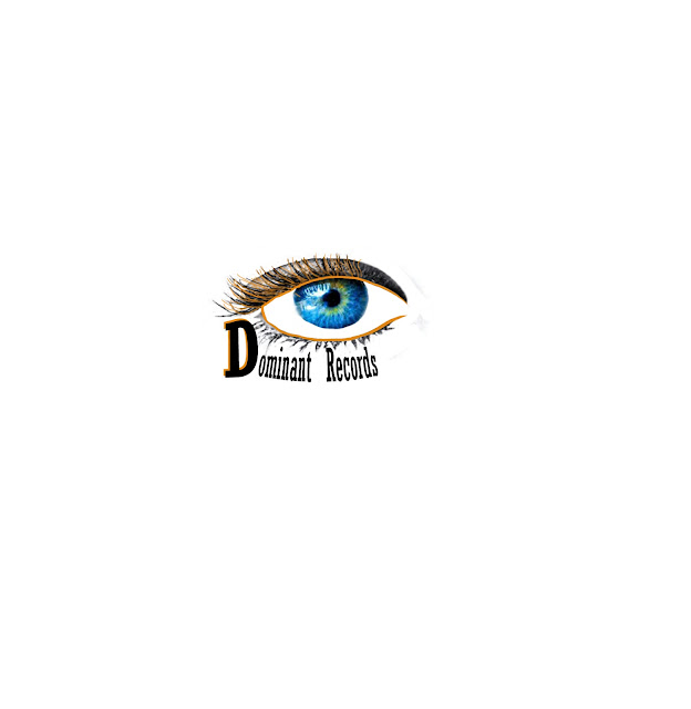
Becuase of this, our record lable logo represents the power and dominance the artist has towards the production of their song when working with out lable.
The black designed into the logo has been used to represent strength and power - this is how our clients will feel when working in cooperation with Dominant Records.
The blue coloured eye has been used to symbolise trust, confidence and truth all of these aspects are what our arists will feel when working with our lable.
The orange eye lashes have been used to represent happiness, creativity and success all these attributes are what our clients feel.
We decided to go with Dominant records instead of F40 Prodctions as it seemed to fit better with the concept of our lable.
Research: Logo explanation
When looking for design which symbolises dominance, I have found that we have a dominant eye in vision.
This research has been very benificial towards the Logo's design.
This research has been very benificial towards the Logo's design.
Planning: Record Label Name Idea
Another record lable idea I have come up with is F40 productions. Standing for - Free40 Productions. modern artist are very restricted when it comes to the release of their music and their identity. This record lable name lets the artists have freedom and movement within their own identity and music, this breaks common conventions of record labels as usually they don't let artists have a say.

This screengrab shows that there is no other record lables with the name F40 Productions.

This screengrab shows that there is no other record lables with the name F40 Productions.
Planning: Possible Record Names
Here are some possible names Kenza and I have thought about using for our record lables name:
- Dominant Records
- Edge Records
- Electro Records
- Fame Productions
- Resistant Records
Sunday 17 September 2017
Technology: FinalCut ProX 2

In lesson we learnt how to use the blade tool first. The blade tool cuts specific sections of the video.

We then used the marking tool. This allows you to line up the music and visuals.

We also learnt how to add a gap through generator. This allowed us to generate sections which will prevent other synced areas from unsyncing.
Technology: FinalCut ProX 1
I learnt how to:
- I had to make sure the hard drive was set up and recognised by the MAC before I opened FinalCut.
- I leant how to rename an event folder. Then I created the project folder, linking it to the event folder.
- I then learnt how to import media and I know to wait for them to fully import before use.
- I Learnt how to insert clips onto the timeline.
- I also learnt how to use the scrubber bar and how to use the up and down keys to move between frames.
Saturday 16 September 2017
Research: Olly murs digipak front cover

I was looking through existing Olly Murs digipak products and loved the look of this front cover. I like the text being behind him. This wil deffinatly influence my final product!
Reseach: Digipak 6 (front cover)
There are many different smaller images of him in the background. Photos of Chris Brown's beginning are shown in the back of the front cover. As they are also in 2 different colours this could further represent his mixed feelings/emotions. Strauss's theory links well with this front cover as he speaks about "good vs bad". Portraying the good and bad sides of Chris Brown through the different colours.
The title of this album could be referring too his loyal fan base as they are the people who showed appreciation, love and dedication towards him, making his "FAME". The font is bright white and of a medium size compared to the images. The paint effect of the font links with the overall painting like design on the front cover. I really like how he has used a graffiti font for his name as it appears as though he has signed it himself. The graffiti writing contrasts with the background this is to draw in the audiences attention, creating a focal point. His name is smaller than the album title, this suggests that he is already an established artists with a large fan base.
How This Research has Influenced my Planning and Creativity
- I really love the vibrancy of the front cover. The rainbow like colour scheme really stands out and is very eyecatching for the viewer.
- The cartoon creates a distinctive, aesthetic pleasing design to look at.
- I like how the colours have been used in this image (blue to red) - fitting with strauss's theory.
Research: Institutions - Spotify

Spotify is a free music, radio and podcasting app/website that allows you to stream popular music online and via the app. Users can pay a subscription of £10 a month, this gives them a premium account allowing them to download music onto your phone, computer or tablet. With premium you are also able to listen to music on more than one platform at once.

In addition, if you are a student you are able to get a £5 discount. making it cheaper for someone in full time education. This institution really appeals to the students in full education.
With over 3 million subscribers paying £5-£10 a month, Spotify is very successful.
Spotify is an ideal
streaming app for students on low incomes as it still gives users an
experience similar to those who pay.
The wide range of music genres helps target a larger audience which is ideal for us we are launching a new artist, associating with the POP genre.

When using the app, you are able to find specific
genres linking to the mood you are in. You are easily able to find
a "workout" or "focus" playlist holding songs that are
related to this mood. This is a perfect aspect for us as millions of
people could find our artists via the POP category.
Spotify also have a playlist on the app specified to the main genres of
music you listen to. 'Discover Weekly' provides the user with songs they have
never heard before but link with their music taste. This is ideal for us as POP
is a very popular genre in students. So the likelihood of our artist’s songs
being in someone’s 'Discover Weekly' playlist is very high.
The statistics on the spotify website show that teenagers and young adults use the app the most.
Finally, I personally feel spotify would is perfectly suited for the launch of our star as they both have the same target audience. The 'Discover Weekly' and 'Genres and Moods' playlists are also a great aspect of the app as it will get our star out there.
Research Magazine Advert 2 - Olly Murs
Kenza and I felt that this advert was perfect to research. It promotes the artist's album which contains our chosen song. We intend to use findings from our research when designing the digipak for the music video.
THE ARTIST:
How This Research Has Influenced My Creativity And Planning :
1. I have identified that a simple background can sometimes be very powerful when attempting to develop a focal point.
2. I really like the unique image of him as he breaks conventions and looks smart at the same time as childish and entertaining.
3. The fonts and text in this advert were very well designed and stand out a lot I really love how the developers have done this.
4. The link to his website was a very good way of promoting more of his products.


THE ARTIST:
Olly Murs is the artist. He looking into the camera, wearing a white shirt with grey trousers held up by red/purple braces. The white shirt really stands out against the background because of its' brightness. The grey trousers and braces develop the synergy of the advert - as the text reflects the same colours as the clothing. Olly Murs is also wearing makeup, this makes his face look a lot fresher and gives him a tanned look. A slight shadow surrounds him, suggesting the picture was shot in a studio environment with artificial lighting and was therefore 'set up' for the purposes of the album. Furthermore, this was done as the advert and digipak were planned to be busy. The top button of his shirt is undone, and this symbolises a 'laid back' attitude, reflected by the fact his hands are in his pockets, so he appears relaxed and comfortable in his surroundings.
His attire also links him with the 'pop' genre, offering a 'chilled out and fun' attitude when compared to the stark formality of, for example, artists who present to the classical music genre. Although this advert presents a fairly 'childish vibe', Olly's appearance still looks very smart and appealing to young teens or adults. Looking into the camera creates a link between the audience. The eye contact engages an intimacy between Olly and his fans, or the targets of this advertising material. Furthermore, the image is the exact same on the advert as it is on the album cover, which develops the cross media convergence and synergy for the artist.
His attire also links him with the 'pop' genre, offering a 'chilled out and fun' attitude when compared to the stark formality of, for example, artists who present to the classical music genre. Although this advert presents a fairly 'childish vibe', Olly's appearance still looks very smart and appealing to young teens or adults. Looking into the camera creates a link between the audience. The eye contact engages an intimacy between Olly and his fans, or the targets of this advertising material. Furthermore, the image is the exact same on the advert as it is on the album cover, which develops the cross media convergence and synergy for the artist.
THE BACKGROUND:
The background of this advert is very bland but very appealing to look at. The simplicity of the background retains a focal point on the artist, with supporting text. The shadow behind Olly Murs shows that the shot was taken in a studio. This directly contrasts with comparable pop genre artists' adverts. Generally, their backgrounds have bright colours or are set in locations which fit with their music video. In Olly Murs' case, the rather bland background almost gives him a unique look, presenting the artist as the main focal point. In addition, the background of the advert is the exact same as the background on his album cover. They have done this to develop the synergy and brand identity for Olly Murs.
FONTS AND TEXT:
At the top of the advert, near the artists face, large red/purple font shows his name. This is a very effective way to promote him as an artist. As well as this, the bright font contrasts the simple background. It stands out and the text is there to capture the attention someone who may be walking past the magazine advert. In addition, there is very strong synergy between the fonts for his album cover and the fonts in the advert. Like the background, this has been done in order to develop the link between the advert and promotional adverts. Smaller black font shows the album name, "right place at the right time". The font seems very cartoon like. As Olly Murs' target audience consists of younger teens and children as well young adults, this font is perfect for his audience. The black colour really stands out and almost synergies with the shadow behind him.
The advert also presents, in smaller writing, the names of his most popular songs. This leads the target audience to move closer, to read more about the detail of the album, but retains the main element - the title of this song, as most important element. These songs are also presented in a red/purple text, which almost acts as a highlight for the text. This smaller font has synergy between the straps of his costume and his name at the top of the page. A link to his website is also written at the bottom of the page, this link gives his fans a way to get in contact with him and find out where his next live performance will be, conveying important information which is relevant to his fan base. The same font is used throughout the advert and album cover, giving it a sort of child like feel. Fortunately, this font works very well when targeting his specific audience.
The advert also presents, in smaller writing, the names of his most popular songs. This leads the target audience to move closer, to read more about the detail of the album, but retains the main element - the title of this song, as most important element. These songs are also presented in a red/purple text, which almost acts as a highlight for the text. This smaller font has synergy between the straps of his costume and his name at the top of the page. A link to his website is also written at the bottom of the page, this link gives his fans a way to get in contact with him and find out where his next live performance will be, conveying important information which is relevant to his fan base. The same font is used throughout the advert and album cover, giving it a sort of child like feel. Fortunately, this font works very well when targeting his specific audience.
How This Research Has Influenced My Creativity And Planning :
1. I have identified that a simple background can sometimes be very powerful when attempting to develop a focal point.
2. I really like the unique image of him as he breaks conventions and looks smart at the same time as childish and entertaining.
3. The fonts and text in this advert were very well designed and stand out a lot I really love how the developers have done this.
4. The link to his website was a very good way of promoting more of his products.
Research: Digipak Advert 1 - Rihanna

How This Research has Influenced my Planning and Creativity
- I love how the colour scheme is entirley linked with hair an lips.
- This advert colour scheme really symbolises love and passion.
- I love how large the front cover is.
- As a close up of her face is on the front cover, it would be a good aesthetic design for the image to be larger. This creates synergy, helping the audience identify her album.
Friday 15 September 2017
Research: We Love Pop Magazine


"We Love Pop" would have been a perfect magazine
to advertise on as they target mainly our exact audience. They
advertise digipaks and YouTube entertainers who also target
14 to 21 year olds. The popularity of this magazine is generated through its' readers and social media following. This audience would have reflected and engaged our fan base. Our close up shots in the digipak would have worked perfectly with
the layout of the front cover of this magazine.
 However, we will not
be able to advertise on "We Love Pop" as they have just published
their final ever magazine. This is very unfortunate for us as this magazine
would have been very helpful when trying to advertise our artist Jake Moss.
However, we will not
be able to advertise on "We Love Pop" as they have just published
their final ever magazine. This is very unfortunate for us as this magazine
would have been very helpful when trying to advertise our artist Jake Moss.
From researching into
this magazine, I have a further understanding of the best shot types and
colours to use on our digipak. It is very unfortunate that we are unable
to work with 'We Love Pop' for advertising. Thankfully there are many other pop magazine companies
still publishing that we could potentially work with. The fact that 'we love pop' were no longer viable means their magazine was inappropriate to meet our needs. I will make a separate post looking into 2 other magazine publishers.
Research: Filters for the Digiak photos


After looking over many different locations, effects and filters we could have for the digipak photos we both really liked the black and white noir filter. We also liked the Vivid Warm filter aswell. Unfortunatly, a black and white filter may not work with the POP genre. However, we could choose to break conventions of pop and use the noir filter. I will do more research into filters and effects on digipaks to find some that will be suitable for the music video.
From the research I have previously looked into, I know that a black and white filter would not work in the main video as it is too dark and would not fit with a pop video at all.

Research: Digipak 5 (front covers)
I looked into existing digipak front covers for Olly
Murs. I really like these 2 as they are original and really show his
emotion in the shot.


The dark colours in this really portray a feeling of sadness
and upset. The black text for his name really stand out. Like his name, the
white "dear darling" text contrasts the grey background. I love the
font used in this as it is almost childlike while still maintaining its
mature and emotional atmosphere.

I really like the use of pink in the background! It really
breaks stereotypes and conventions as pink is almost never used in male pop
digipaks. The same font has been used on both cover I researched. Just like the
other digipak, it shows his uplifting, happy emotion. I also love the fact his
denim jacket contrasts the pink background. This research was very effective
towards my creativity as I am now confident what colours to use when showing
emotion in our digipak.
How This Research has Influenced my Planning and Creativity
- The pink background really breaks conventions of male pop artist advert. I really like this aspect as it makes it unique.
- I like how emotion is targetted in both of these front covers.
- I also think the same font on both adverts has worked really well in developing the brand identity for Olly Murs.
Research: Digipak 4 (Thinglink)

How This Research Has Influenced My Creativity and Planning :
- The colour scheme for this Digipak is great! I love the different shades of reds, pinks and greens.
- I like the thin large font for the names of the album and artist. Unfortunately, in our digipak we are unable to use small font for the artist’s name as we are attempting to develop a star identity.
- I really like the border around the back section of the CD. It works really well with the colour scheme and aesthetics of the CD and digipak.
Research Digipak 3

How This Research Has Influenced My Creativity And Planning :
- I real like the artistic design and colour scheme used for this digipak.
- I like the way there is no photos of the artists at all. However, I could not use this in my Digipak as we need to create the stars identity, so using a photo of the star is very important.
- I like the way the CD slots into a little compartment.
- Again, in this digipak, the institutional details is in small print.
Research Digipak 2
 How This Research Has Influenced My Creativity And Planning :
- I don't like how the background behind the star is a normal wooden fence, I personally feel this makes it look very simple.
- I like the colour to the roses on the CD, unfortunately I cannot see any synergy within the colour so I don't really see the point in them.
- I like the way the hit song "born to die" is in a blue font over her white top. The colour helps it stand out and synergises with the sky.
- Again in this Digipak the institutional details are printed in a small font.
- I like how the the artists name is in a bold white font at the top of the front cover. White text stands out.
Research Digipak 1
 How This Research Has Influenced My Creativity And Planning :
- I really like the way the black colours create an atmospheric attitude.
- The colour scheme works very well. The use of gold, black and white works very well. Each colour contrasts the other, helping it become easier to read and stand out.
- The gold font for the artist’s name makes it clear that they are very important.
- I now know that in the Digipak I will need to use a smaller font for the institutional details.
- I really like how the photo is the same in the album and the poster, developing synergy and brand identity.
Thursday 14 September 2017
Research 8 : Bruno Mars - "Granade"

The video opens with a pull focus, going from blurred to sharp. This has been done very well and is a great way of starting it. As the lighting is low key to begin with, this pull focus helps develop focal point. The rain in the background signifies the upset and sorrow of Bruno. His Orange top conrasts against the darker colours in the rest of the shot. He is also singing into camera, starting with the performance based aspects.

The Bright lighing on the picture creates another clear focal point, however this time it is done as an attempt to take your eyes away from the artists and onto the photo. The LowKey lighting surrounding this shot created a of frame.

A close up of the artist holding a picture has been used to show his tattoo of her and them both in the picture. It is clear the tatoo signifies that his love for her was strong as he has a permenant picture of her on his arm. The breaking of the glass in the picture symbolises the break up of their relationship.

An over the shoulder shot is used here. The shot lenght of the broken glass is about half a second and on the beat. The glass is broken on her, symoblising that is was her that broke them apart.
 Another pull focus was used when it jump cuts to a different location. This shot was very well done as it set the scene for the rest of the video. Like the broken picture shot, the shot length is fast. (around half a second) The tunnel roof looks very much like that of a cathedral. This could link with representations of marriage.
Close up and medium close ups are used cutting quickly between 2 different locations. In one of the shots he is singing into cam and the other shows a tracking shot of the artist struggling, pulling a piano through a tunnel. Piano's are closley linked with a feeling of love and emotion. The symbolism with the piano works very well with the narative and concept of the video. When the performance based shot is on, you are able to see his emotion and passion through the facial expressions he is making. These expressions develop the concept of a broken heart. This shot is effective as it has been used to symbolise the extent that he would go through to make the girl happy. He is wearing a black suit and a white buttoned up shirt and tie. This costume works very well with the natural lighting. The white shirt symbolises his innocence and purity. In addition, as he is wearing a suit, it shows that he wants to make a good impression look smart for her. Further constructing the idea that he'd do anything for her, even if is means dragging a piano miles through busy traffic wearing a suit.

Furthermore, natural lighting from the tunnel lights and passing cars are used in a close up shot of Bruno. This shot is very powerful towards the viewer as you can see how hard he is trying give the girl what she wants, developing the narrative of the video.

A side on long shot is used here, showing the entire piano and him pulling it up using rope. The rope throughout these shots symbolise 'tying a knot' or getting married. He is dressing smart and dragging a piano to her to tie the knot on their relationship.

The shot then cuts as a truck passes, beeping its horn. Digetic sound is very effective in a music video with this type of concept and narrative to it. The medium shot shows the artists in complete darkness, you are only able to see his white shirt, piano and the walls of the tunnel. This shot could symbolise how closed in he is due to him being surrounded by nothing but darkness.

A close up of a homeless man in the tunnel emphases how desperate the artist is to 'tie the knot' on their relationship. The homeless man is wearing a red hat, this could have been used in order to develop a warm atmosphere in the shot as red represents love and desire. However, red also represents danger and hatred. Either of these representations could work with the concept of this video as he loved her but she doesn't love him.

The shot then becomes performance based as he is singing on camera. His tie is still fully on and his top button is still up. The camera also tracks him from the front.
 Furthermore, as bruno leaves the tunnel, he is seen by a group of gang members wearing white tops and sagged jeans. They also have many tattoos. All of the costume designs in this shot portray gang member stereotypes very well. As he is wearing a suit and tie, he really contrasts the group, showing how different they are from each other.
Slow motion of the bull dog barking creates a scary atmosphere for the shot. Bull dogs can be very aggressive and are commonly stereotyped with people who commonly break the law. As well as this, the chain around its neck develops the intimidating atmosphere more.

A wide angle shot shows the gang members yelling at Bruno in an intimidating way. He is seen trying to ignore them. This shot is again reinforcing the meaning of him pushing past everything in his way to give her what she wants.

The chourus is then played for a second time. the average shot length beings to slightly faster. A close up of a crazy man stood in an alley way is played to show him turning around and seeing bruno dragging the piano. It then cuts to a side angle long shot trackin the artist meeting this crazy man that runs up to him. The crazy mans camoflague jacket really develops the synergy front the graffiti on the walls in the background.

A extreme long shot shows the POV from the girls window. You can see Bruno still dragging the piano through. It then cuts to a medium close up of the artist looking up at the window. The natural ligting really develops the shot. his top button is now undone and his tie is pulled down. This emphasises his struggle. As he is looking up at the window it represents the dominance of the woman and the control she has him.

A POV shot shows us the artists perspective. The woman he brought the piano for is seen in a low angle, kissing a man. She is wearing a white top, symbolizing her purity and perfection. Seeing her in such 'pervection' liks with laura mulveys theory of "Male Gaze". Although she is not in minimal clothing, she is still considered very attractive towards the male audience and it is clear they have done this to show her as a perfect woman.

An over the shoulder, extreme longshot is used now showing her perspective of him then walking back with the piano. Like the other shot, he is seen from a high angle, symbolzing her dominance and power over him. The road is empty realy representing his lonleyness in an intense way.

The lyrics match realy well with the visucla in this shot. When he sings "You never, ever, ever, did baby" She is seen almost hiding away as if she has been caught out. It then cuts to another close up tracking shot of himpulling the piano.

The chourus then repeats again. However, as it is the last chourus he seems to almost be shouting the lyrics. This really creates an emotional atmosphere for the viewer as you can see how hurt he is. A close up tracking shot follows him up a bridge now pushing the piano up. He is no longer using the rope. This could mean that now hes caught her with another man he doesnt want to 'tie the knot' on their relationship. This shot is also performance based as he is singing.

In the folling shots he is then pulling the piano with the rope again. This could symbolise that he doesnt know what to do with her and that he would forgive her and tie the knot. A meduim close up of a priest seen walking across the street infront of him. That also represents he concept of marriage and love.

Finally, red lights are shown, represneting a train track. Red symbolizes danger. The ending sequence of the video shows him standing on a train track singing "but you wont do the same". As the whole son is about him doing everythign for her. This is a very powerfull message shown through a video and song.

How This Research has Influenced my Planning and Creativity
- I love how the concept and narrative of the story is told clearly throughout. I really understood what the video was about.
- I also liked the representations in this video. (The rope, piano, suit)
- I liked the way lighting and colour was used to further portray the emotions and develop tension.
Subscribe to:
Posts (Atom)
-
On our first day of filming, our shot locations were the park and Brigg town. Arriving at 12 and ending at 4. The date was Monday the 23rd o...
-
 https://www.youtube.com/watch?v=RgKAFK5djSk The establishing shot for this video is a long shot of a beach, this shot sets them init...
 -
 The overall look of the shots we have taken have a mainly rural mise-en-scene. The green sign we will be holding up will be green, devel...