- The banners opacity and colour has been changed. We thought this would look aesthitically pleasing so, all the boxes highlighting words have had the opacity changed to 70%.
- The size of the Digipak front cover is alot smaller now.
Friday 8 December 2017
Planning: Our actions prior the Target audience research 6
What have we changed after the target audience research from draft 4?
Thursday 7 December 2017
Planning: Target Audience Analysis on Advert Draft 4
After constructing a target audience research on the banner and size of the front cover image. I now think that the opacity on the banner should be lowered, making it almost see through. As well as this, the size of the album front cover will be downsized to at least half the size as it became the focal point of the advert. This would have been a problem as we need to develop the star image and brand identity. The advert is also about promoting Jake Moss as an artist, not just one song.
Monday 27 November 2017
Professional advice: Blueprint Editor Workshop
Our group was fortunate enough to have a Blueprint Film Foundation professional editor to come in and deliver a workshop which helped us to learn more advanced editing skills.
Dave spoke for one hour about different editing techniques eg luma key and how to alter colour, saturation levels and also how to use filters effectively.
This enabled us to edit our music video to a higher-level. In addition, we added effects and filters to develop the representation of the star image; we enhanced "warm" and "cold" shots and this also improved our narrative.
In some of our shots the lighting wasn’t the same, making
the shot where he says "Till it’s gone, gone away" very average and
boring. After the workshop we were able to up the saturation and change
the lighting so it appears exactly same in each shot.
Furthermore, he also advise dus about cutting with the rhythm or on the beat. Some of our cuts were off beat.
He said "It might take a while to zoom in really closely and use the arrows but it’s well worth it because you can be sure each cut is perfectly on beat". After this, Kenza and I sat down together and sorted out the cuts and we are really happy with our learning and journey. The end product is now starting to look more professional and advanced.
He said "It might take a while to zoom in really closely and use the arrows but it’s well worth it because you can be sure each cut is perfectly on beat". After this, Kenza and I sat down together and sorted out the cuts and we are really happy with our learning and journey. The end product is now starting to look more professional and advanced.
I personally feel that the workshop helped dramatically with our
progress and we are both now a lot more confident with Final Cut Pro X.
Conclusion: Digipak Research
How This Research Has Influenced My Creativity And Planning :
- I really like the way the black colours create an atmospheric attitude.
- The colour scheme works very well. The use of gold, black and white works very well. Each colour contrasts the other, helping it become easier to read and stand out.
- The gold font for the artist’s name makes it clear that they are very important.
- I now know that in the Digipak I will need to use a smaller font for the institutional details.
- I really like how the photo is the same in the album and the poster, developing synergy and brand identity
- I don't like how the background behind the star is a normal wooden fence, I personally feel this makes it look very simple.
- I like the colour to the roses on the CD, unfortunately I cannot see any synergy within the colour so I don't really see the point in them.
- I like the way the hit song "born to die" is in a blue font over her white top. The colour helps it stand out and synergises with the sky.
- Again in this Digipak the institutional details are printed in a small font.
- I like how the artists name is in a bold white font at the top of the front cover. White text stands out.
- I real like the artistic design and colour scheme used for this digipak.
- I like the way there is no photos of the artists at all. However, I could not use this in my Digipak as we need to create the star’s identity, so using a photo of the star is very important.
- I like the way the CD slots into a little compartment.
- Again, in this digipak, the institutional details are in small print.The colour scheme for this Digipak is great!
- I love the different shades of reds, pinks and greens.
- I like the thin large font for the names of the album and artist. Unfortunately, in our digipak we are unable to use small font for the artist’s name as we are attempting to develop a star identity.
- I really like the border around the back section of the CD. It works really well with the colour scheme and aesthetics of the CD and digipak.
- I also think the same font on both adverts has worked really well in developing the brand identity for Olly Murs.
- I like how emotion is targeted in both of these front covers.
- The pink background really breaks conventions of male pop artist advert. I really like this aspect as it makes it unique.
- I really love the vibrancy of the front cover. The rainbow like colour scheme really stands out and is very eye-catching for the viewer.
- The cartoon creates a distinctive, aesthetic pleasing design to look at.
- I like how the colours have been used in this image (blue to red) - fitting with Strauss’s theory.
Saturday 25 November 2017
Planning : Group Post - Target Audience Research for Rough Cut 2
1] Do you understand the narrative of the music video?
2] Do you think the video is clearly of the pop genre?
5] Do you think visuals and lyrics matched?
6] What was your favourite shot and why?
7] Which shots didn’t you like? Didn’t understand?
8] What representations have been created?
9] Does this music video launch the male singer as a new star? Would this video make you look online for more information about him? Do you like him?
Wednesday 22 November 2017
Conclusion: Advert Research
How This Research Has Influenced My Creativity And Planning :
- I have identified that a simple background can sometimes be very powerful when attempting to develop a focal point.
- I really like the unique image of him as he breaks conventions and looks smart at the same time as childish and entertaining.
- The fonts and text in this advert were very well designed and stand out a lot I really love how the developers have done this.
- The link to his website was a very good way of promoting more of his products.
- I love how the colour scheme is entirely linked with hair and lips.
- This advert colour scheme really symbolises love and passion.
- I love how large the front cover is.
- As a close up of her face is on the front cover, it would be a good aesthetic design for the image to be larger. This creates synergy, helping the audience identify her album.
Friday 10 November 2017
Research: Target Audience 4
We asked members of our sixth form and lower school (ages 14-18) to watch our video and answer questions relating to the genre, presentation of the star and if she found it interesting.
These are the questions we asked and answers we received from this research:
1] What genre of music video does it look like?
(Female aged 16) Pop
(Female aged 14) Romantic Pop
(Female ages 17) Pop
2] Do you like the way he male star is presented? What do you like? -
(Female aged 16) I like the way he's presented as a typical teenager applying to the target audience. I also really like the way he looks like he’s singing the sing.
(Female aged 14) yes, looking into the camera and it looks like hes speaking to you.
(Female aged 17) yes the pink clothes help link him to more of the female audience.
3] Would the MV make you interested in finding out more about him? -
(Female aged 16) Yes, seems interesting, want to know more about him. I want to know why he wants to "bring love back around".
(Female aged 14) Yes, I wanna know why he's lonley.
(Female aged 17) Yes, I'd like to see what else he thinks about.
4] Which shot do you like the best and why?
(Female aged 16) I like the way people are holding up a "bring love back aroud!"poster - spreading positivity. How he looks to be sining the song - this looks authentic and preffesional.
(Female aged 14) I like the shot of the hands in the shape of a love heart. It is really effective when your trying to bring love back around.
(Female aged 17) My favourite - when he faces the camera on the first words. It makes feel like the audience is included. "you, you, you" when he's clothes change.
5] What is the narrative of the MV? What dont you understand about the story?
(Female aged 16) I understand that the story is about spreadin positivity and brining "Love Back Around". Narrative - spread positivity as throughout the song the main these is "Bring Love Back Around".
(Female aged 14) Love, he is lonley and wants to be loved.
(Female aged 17) Brining trust in people back to the mainstream.
6] What dont you like?
(Female aged 16) some of the shots sound drowns out the song.
(Female aged 14) the part with the poster, it would look better if they were saying it aswell.
(Female aged 17) the shots of the phone being there, then disapearing the hand moved slightly.
Research findings:
1]This research has been very helpful as we now have an idea regarding the thoughts of our target audience. It is brilliant that our target audience can identify our genre so easily, as this was a key target for us. We intentionally used pop genre conventions in order to anchor this meaning.
2] It is also perfect that our TA sees our star as a typical teenage boy. This is exatly what we have attempted to create regarding his apperence and facial expressions. As she also likes the singing into camera aspect, using this throughout the MV was a very good idea due to it also developing the pop genre conventions.
Planning: Thankyou (group post)
To say thank you to Connor we bought him a weatherpersons meal, a card and a small gift to show him how appreciative we are for him acting in our video.
Wednesday 1 November 2017
Planning: Evaluation of film shoot (23rd,24th,29th Oct)
On our first day of filming, our shot locations
were the park and Brigg town. Arriving at 12 and ending at 4. The
date was Monday the 23rd of October. We were very successful
throughout the day as we achieved many of our key shots
for 2/4 locations we plan on shooting at.
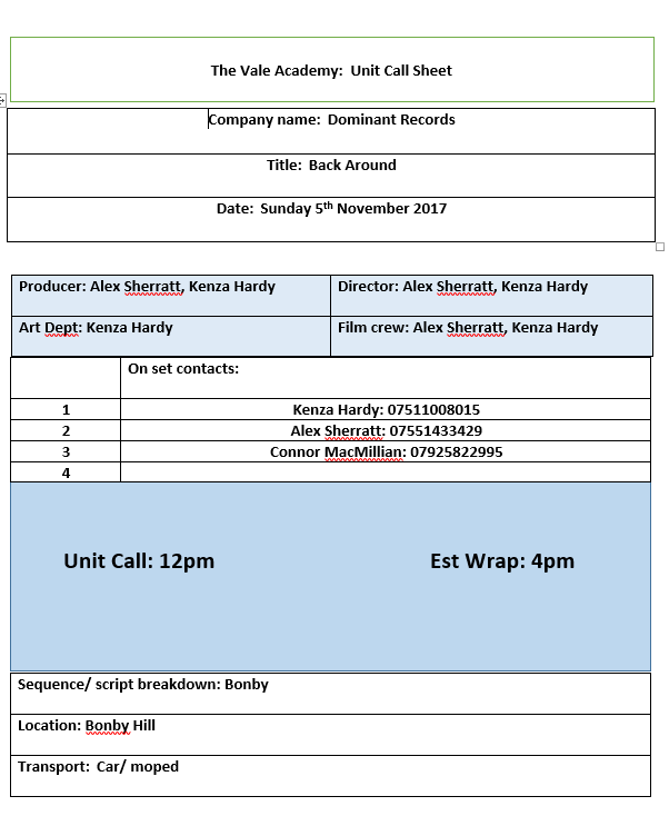
We needed a very quiet period in a town location, so chose a Sunday afternoon to film the town shots. We knew Brigg would be less populated on a Sunday, rather than Monday. We reviewed the weather forecast and identified the afternoon of Sunday 20th October as a perfect time of day to film. However, the weather forecast was wrong, at 2 o’clock, it began to pour with rain. The footage we had collected prior to the downfall was very good. However, after 2pm, filming became impossible and so the shoot was rescheduled for 5th of November at 12pm.
On our plan, we wanted to film all the shots in Brigg town
before heading over to the park and filming there. Unfortunately, when
planning we didn’t take into consideration the towns heavy population during
half term. As there are 2 secondary schools and 2 primary schools
based in Brigg, many younger children and teenagers stood the risk of
walking into shot. This could have caused issues regarding safety as we
would have needed parental consent. As we did not have enough
time or control to ask if people would be okay with standing out
of the shot while we filmed, we decided upon moving locations to the park,
only getting half of the shots we planned on taking. This came as a learning
curve to us as we now know to take into consideration the heavy population that
comes with a half term break. Looking back at it we should
have arrived and filmed earlier as most younger children and
teenagers are not around town in the morning.
When filming in the park there was no one around, making it
a perfect time to film. We took many of the shots we planned on taking on
another day of filming. During the filming we came up with more ideas that
could have worked in the music video. Shooting these ideas gave us more options
to work with. In the park we stumbled upon one key issue, a group of teenagers proceeded
to make noise making it very difficult to focus when shooting. A lot
of the shots we attempted to take during filming were spoiled by
this group of teens. Because of this we decided to move locations again to
another area in Brigg town. This wasn’t quite what we wanted to do but there
was nothing else we could have done. Fortunately, the area we filmed in Brigg
after filming at the park was perfect, barely anyone was around and we were
able to get some great shots linking to the lyrics "dead in this
town".
On Tuesday the 24th of October, we filmed at the location
Kenza's House between the times 1-3pm. This was a great time of day to film at this
location as the weather and lighting was ideal for filming inside a house in Doncaster.
This shoot was very successful, and all planned shots were perfectly executed as planned in the
script breakdown. The private location meant that our actor’s
confidence was raised drastically. He has been very easy to work with and
been fully co-operative throughout. The single problem we had when filming
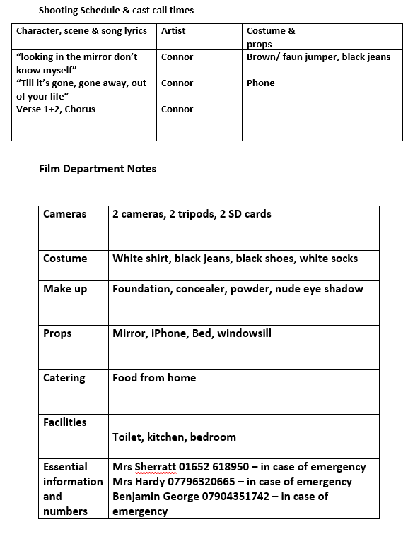
at Kenza's House was the shot of Connor as he stood in an a particular area of the location. The lighting was different in the kitchen and this meant that the darkening weather affected the shot considerably. We determined that it wasn’t necessarily a vital shot, and felt that moving it to another location would not have caused an issue. If the shot taken within the location had been necessary, we could have rescheduled it on an alternative day
when the weather was better.
We needed a very quiet period in a town location, so chose a Sunday afternoon to film the town shots. We knew Brigg would be less populated on a Sunday, rather than Monday. We reviewed the weather forecast and identified the afternoon of Sunday 20th October as a perfect time of day to film. However, the weather forecast was wrong, at 2 o’clock, it began to pour with rain. The footage we had collected prior to the downfall was very good. However, after 2pm, filming became impossible and so the shoot was rescheduled for 5th of November at 12pm.
I am personally very happy with the progress we made as a
team when filming in all locations. We are both really happy with how the video is
starting to turn out and are glad we are a great working team.
Throughout this filming we have learnt to understand and take into consideration how populated an area could be depending on the day, time, weather and school holiday dates. Communicating with the team is essential. We had to be sure all the required people could attend the shoots and that everyone knew what was expected for each shot.
We also learned that shots which pull back to a high angle, and low tracking shots can be very difficult to do without the right technology.
Planning : Lunch For The Actors
To say thank you to Connor, I paid for a Weatherspoon’s lunch. I
felt this was necessary as he took hours out of his day to help us work on the
music video. In addition, I also felt buying him lunch would help him feel
comfortable when acting in public.
Research: Similar Product Research (Adverts)
Similar Product Research (Adverts) from AlexanderSherrattASmedia
I feel this research was vital towards my planning as I now understand that the lighting can be used in a shot to emphasise colour and make it stand out. As well as this, a bright coloured footer can develop the band identity with the artist and that colour, e.g, Ed Sheeran.
I feel this research was vital towards my planning as I now understand that the lighting can be used in a shot to emphasise colour and make it stand out. As well as this, a bright coloured footer can develop the band identity with the artist and that colour, e.g, Ed Sheeran.
Tuesday 31 October 2017


Friday 27 October 2017
Conclusion: Music Video Research
How This Research has Influenced my Planning and Creativity
- The close up performance based shots really emphasise the emotional concept and hidden meaning throughout the video.
- There are many gender characteristics in this video - for example the women are dressed in minimal clothing and the men in suits and regular clothing. In turn, fitting with Laura Mulveys theory of 'male gaze' as they are dressed to appear attractive to the opposite sex
- Cars in the background of some of the performance shots help the video link with the 'Fast and Furious' Concept.
- I love the scenery and backgrounds of the shots in this music video.
- The videos concepts are shown very well throughout. I love how they had people sticking question marks around the city.
- The costumes in the video look very modern for the time the video was released. I now know that in Pop music videos you can just use modern costumes and outfits.
- The close up shots in this video really work with Goodwin’s theory. many people now associate Will.I.Am's voice with his face due to the close ups in a lot of Black Eye Peas videos.
- I really like the colour scheme and lighting in this video. The golden colours really emphasise the rich colours and costume.
- I love how performance based this video is, to fit with Goodwin’s theory we will need to use many performance based shots in our final music video.
- The narrative based aspects of this music video were very prominent throughout. I liked how clear the story was told.
- Overall this music video has helped a lot regarding research and ideas for our groups music video. I have learnt that using a mixture of narrative and performance based concepts is a good idea as it not only provides a type of story for the viewer to see but also involves a live performance type of style. I now know that I will need a significant amount of costume changes to represent gender, class, age and culture.
- I really like how here are quotes from the media in the background of some shots.
- The framing of some of the shots are perfect! They really represent the emotions she is expressing throughout the song.
- The close up shots work really well when showing the viewer the narrative of the song
- Making a social comment - we want to include ideas about peace and war in our music video. Black eyed Peas also inspired this. I want to infer these ideas rather than the being explicit. However, we are going to use newspaper articles - this creates intertextuality and multimedia.
- Gaga is very much about empowering the modern woman.
- There is a great deal of choreography, this is not something we have thought about doing in our music video. However, we will need to ask our star to move to the beat of the song.
- Lighting represents different meanings throughout this music video (Black = Hell, White = Heaven) We will do something like this as it will work with our meanings and social statements we will be making.
- Strauss's theory of binary opposition was used in this music video. We will use this theorist throughout as we will be showing the good and bad sides of life. (Peace/Hate) we will use this by having out artist wearing lively clothing.
- Throughout this music video there are many different aspects of intertextuality. Intertextuality will be used in our music video through the newspaper, photographs, posters and earphones. Earphones are regularly used in modern music videos.
- Laura Mulveys theory of representation was heavily met through the entirety of the music video. We will need to make sure if we do use a female actor in the music video, that she is dressed in clothing which would attract the male audience.
- Lighting - I like the way the props lighting effects the lighting for the entire shot. - I now understand that dull natural lighting creates a mood/atmosphere for the entirety of the music video.
- I like how emotions are shown in different ways. For example, back turned, Crying, Dark clothing, lighting.
- I now know I need to use specific lighting to create a certain mood throughout the video.
- I liked the way lighting and colour was used to further portray the emotions and develop tension.
- I also liked the representations in this video. (The rope, piano, suit)
- I love how the concept and narrative of the story is told clearly throughout. I really understood what the video was about.
Friday 20 October 2017


Wednesday 18 October 2017
Planning: Risk Assessment start
I have started filling in risk assessments for - Alex's house, The Park and Bonby hill. Kenza will do the risk assessments for Kenza's House and Town.

This is the begginging of the risk assessment for Alex's House.
Monday 16 October 2017


Friday 13 October 2017


Planning: Shot List (Group Post)
Shot List
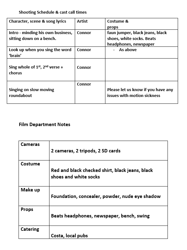
Sequence 1 Location; Park
1. LA MS shot of Connor walking to the bench and sitting down. Make cut from side shot to head on shot.
2. HA Over the shoulder shot as Connor puts his headphones in. In the park behind the angel.
3. SRS of newspaper and Connor singing into camera. Connor looks up on the work “brain”
4. Centre frame montage of people in war. CU. All three lyrics
Sequence 2 [chorus] Location Park Town [Brigg]
1. Slower ASL. MLS bursting through gate, out of park. LF through gate then RF. Tracking back so Connor is walking head on to us.
2. LS of Connor in an empty town and tracks back to an ELS. Connor CF
3. Brigg Park playground roundabout. Spins forward and then backwards.
4. Montage of previous shots. Roundabout/ someone laughing
Sequence 3 Locations: Kenza’s house & , [Hill Bonby & Alex’s House
1. CU Laughing [Hill Bonby.]
2. “Paradise” , [Hill Bonby CU iPhones Kenza’s house, weather , [Hill Bonby
3. Gone, sunset going down ELS, empty hand with no phone CU, [Hill Bonby.] & Kenza’s house
4. LS mirror singing to the mirror Kenza’s house
5. Fire burning out “Hell” Alex’s House
Sequence 4 Locations: Hill Bonby , Town [Brigg]
1. Singing into camera in sunset location and then tracking from behind. Hill Bonby
2. Repeated “dead town” in different location Brigg CF
3. MCU of public holding up sign in town (montage), cutting between Connor singing into camera. Town [Brigg]
Sequence 5 locations: Town [Brigg], Hill Bonby, kenza’s house, park
1. CU of Connor’s Hand, cut to him SIC in town MCU
2. CU two people holding hands, cut to him SIC in town MCU
3. Hand cupped in shape of heart (sunset), cut to him SIC in town MCU Hill Bonby Town [Brigg]
4. 3 locations town, kenza’s house, park
5. Repeated for resat of bridge with different costumes and props. “trust” we could use a chain
1. Repeated chorus locations but different bright coloured costumes. Using different people for backing vocals Park Town [Brigg
2. HAS of him looking up into camera wearing a red shirt (LOVE) with people wearing costumes that contrast the red. Location Town [Brigg
3. Repeat of shots. Same locations different costumes. (Brigg Park – MS on roundabout in different costume)
Ending – LS of Connor stood looking over the river. LAS pans from behind the gate to behind him. Connor then walks away in the opposite direction and music fades. Park Monday 9 October 2017
Planning: Photo Board (Group Post)

- The overall look of the shots we have taken have a mainly rural mise-en-scene.
- The green sign we will be holding up will be green, developing synergy throughout the video.
- There are some location shot taken in the town cente, these shots contrast against the rural, greener colours.
The Overall Look There is a recurring use of green especially in our prop shot and location shots. This creates a relationship between the two and gives our artist a brand identity. The red on the artists shirt coincides with the red on the love heat and the charity shop the red cross. We decided to use the red cross because hey are the main charity that goes abroad when disaster strikes and our music video represents disaster and conflict. We have also discussed using the autumn season because it coincides with the green and red brand identity of the artist and the weather is overcast but has the occasional sunny day which symbolises dark into light meaning war into peace.
Locations
We have used mainly rural locations with a few urban locations. The amount of urban shots is limited due to living in a rural area with a small historical town to use for urban shots. Throughout the video we are trying to put across the idea of an empty place due to conflict. This creates Goodwin's theory of having a relationship between lyrics and visuals because one of the lyrics in our song is "and it feels dead, in this town". This also applies to the empty urban scene.
We feel that most of the rural shots are better than the urban ones, especially the ones of our artist sat on the bench. This is because our idea was to have him contemplating on how we are affected today and reflect on how previous conflicts have changed the world. We think the bench shots portray that idea really well. The only urban scene that works better than some o the rural shots is the close up of our artist looking at the shop window. The words on the window are "unconditional care in a crisis" and shows how the Red Cross help others.
Costume and Makeup
In general the costumes are good and they tie in with the artists brand identity and the colours we want to create. We could use brighter colours as well as the red checked shirt. This is due to a convention of the pop genre being bright and happy. We would be adhering to conventions but we would also be brightening up the video. This type of costume could be used at the end as the transition from war to peace is being made. The red and the green also conflict each other as well as stand out against each other and this is making a statement and is symbolism. The red on the shirt symbolises love and bringing love back around is our key message.
Props
We are happy with using the sign and wouldn't want to change that as it is a bold statement. It was also heavily influenced by the Black Eyed Peas video "Where is the love" and felt it would be a great idea for our video
Subscribe to:
Posts (Atom)
-
On our first day of filming, our shot locations were the park and Brigg town. Arriving at 12 and ending at 4. The date was Monday the 23rd o...
-
 https://www.youtube.com/watch?v=RgKAFK5djSk The establishing shot for this video is a long shot of a beach, this shot sets them init...
 -
 The overall look of the shots we have taken have a mainly rural mise-en-scene. The green sign we will be holding up will be green, devel...