Friday, 15 September 2017

Research: Digipak 5 (front covers)

I looked into existing digipak front covers for Olly Murs. I really like these 2 as they are original and really show his emotion in the shot.


The dark colours in this really portray a feeling of sadness and upset. The black text for his name really stand out. Like his name, the white "dear darling" text contrasts the grey background. I love the font used in this as it is almost childlike while still maintaining its mature and emotional atmosphere.


I really like the use of pink in the background! It really breaks stereotypes and conventions as pink is almost never used in male pop digipaks. The same font has been used on both cover I researched. Just like the other digipak, it shows his uplifting, happy emotion. I also love the fact his denim jacket contrasts the pink background. This research was very effective towards my creativity as I am now confident what colours to use when showing emotion in our digipak.


How This Research has Influenced my Planning and Creativity

  • The pink background really breaks conventions of male pop artist advert. I really like this aspect as it makes it unique.
  • I like how emotion is targetted in both of these front covers.
  • I also think the same font on both adverts has worked really well in developing the brand identity for Olly Murs.

Research: Digipak 4 (Thinglink)


    How This Research Has Influenced My Creativity and Planning :
    • The colour scheme for this Digipak is great! I love the different shades of reds, pinks and greens.
    • I like the thin large font for the names of the album and artist. Unfortunately, in our digipak we are unable to use small font for the artist’s name as we are attempting to develop a star identity. 
    • I really like the border around the back section of the CD. It works really well with the colour scheme and aesthetics of the CD and digipak.

    Research Digipak 3


    How This Research Has Influenced My Creativity And Planning :
    • I real like the artistic design and colour scheme used for this digipak.
    • I like the way there is no photos of the artists at all. However, I could not use this in my Digipak as we need to create the stars identity, so using a photo of the star is very important.
    • I like the way the CD slots into a little compartment.
    • Again, in this digipak, the institutional details is in small print.

    Research Digipak 2


    How This Research Has Influenced My Creativity And Planning :


    • I don't like how the background behind the star is a normal wooden fence, I personally feel this makes it look very simple.
    • I like the colour to the roses on the CD, unfortunately I cannot see any synergy within the colour so I don't really see the point in them.
    • I like the way the hit song "born to die" is in a blue font over her white top. The colour helps it stand out and synergises with the sky.
    • Again in this Digipak the institutional details are printed in a small font.
    • I like how the the artists name is in a bold white font at the top of the front cover. White text stands out.

    Research Digipak 1

    How This Research Has Influenced My Creativity And Planning :

    •  I really like the way the black colours create an atmospheric attitude.
    • The colour scheme works very well. The use of gold, black and white works very well. Each colour contrasts the other, helping it become easier to read and stand out.
    • The gold font for the artist’s name makes it clear that they are very important.
    • I now know that in the Digipak I will need to use a smaller font for the institutional details.
    • I really like how the photo is the same in the album and the poster, developing synergy and brand identity.

    Thursday, 14 September 2017

    Research 8 : Bruno Mars - "Granade"


    The video opens with a pull focus, going from blurred to sharp. This has been done very well and is a great way of starting it. As the lighting is low key to begin with, this pull focus helps develop focal point. The rain in the background signifies the upset and sorrow of Bruno. His Orange top conrasts against the darker colours in the rest of the shot. He is also singing into camera, starting with the performance based aspects.


    The Bright lighing on the picture creates another clear focal point, however this time it is done as an attempt to take your eyes away from the artists and onto the photo. The LowKey lighting surrounding this shot created a of frame.


    A close up of the artist holding a picture has been used to show his tattoo of her and them both in the picture. It is clear the tatoo signifies that his love for her was strong as he has a permenant picture of her on his arm. The breaking of the glass in the picture symbolises the break up of their relationship.


    An over the shoulder shot is used here. The shot lenght of the broken glass is about half a second and on the beat. The glass is broken on her, symoblising that is was her that broke them apart.


    Another pull focus was used when it jump cuts to a different location. This shot was very well done as it set the scene for the rest of the video. Like the broken picture shot, the shot length is fast. (around half a second) The tunnel roof looks very much like that of a cathedral. This could link with representations of marriage.


    Close up and medium close ups are used cutting quickly between 2 different locations. In one of the shots he is singing into cam and the other shows a tracking shot of the artist struggling, pulling a piano through a tunnel. Piano's are closley linked with a feeling of love and emotion. The symbolism with the piano works very well with the narative and concept of the video. When the performance based shot is on, you are able to see his emotion and passion through the facial expressions he is making. These expressions develop the concept of a broken heart. This shot is effective as it has been used to symbolise the extent that he would go through to make the girl happy. He is wearing a black suit and a white buttoned up shirt and tie. This costume works very well with the natural lighting. The white shirt symbolises his innocence and purity. In addition, as he is wearing a suit, it shows that he wants to make a good impression look smart for her. Further constructing the idea that he'd do anything for her, even if is means dragging a piano miles through busy traffic wearing a suit.


    Furthermore, natural lighting from the tunnel lights and passing cars are used in a close up shot of Bruno. This shot is very powerful towards the viewer as you can see how hard he is trying give the girl what she wants, developing the narrative of the video.


     A side on long shot is used here, showing the entire piano and him pulling it up using rope. The rope throughout these shots symbolise 'tying a knot' or getting married. He is dressing smart and dragging a piano to her to tie the knot on their relationship.
    The shot then cuts as a truck passes, beeping its horn. Digetic sound is very effective in a music video with this type of concept and narrative to it. The medium shot shows the artists in complete darkness, you are only able to see his white shirt, piano and the walls of the tunnel. This shot could symbolise how closed in he is due to him being surrounded by nothing but darkness.

    A close up of a homeless man in the tunnel emphases how desperate the artist is to 'tie the knot' on their relationship. The homeless man is wearing a red hat, this could have been used in order to develop a warm atmosphere in the shot as red represents love and desire. However, red also represents danger and hatred. Either of these representations could work with the concept of this video as he loved her but she doesn't love him.
    The shot then becomes performance based as he is singing on camera. His tie is still fully on and his top button is still up. The camera also tracks him from the front.

    Furthermore, as bruno leaves the tunnel, he is seen by a group of gang members wearing white tops and sagged jeans. They also have many tattoos. All of the costume designs in this shot portray gang member stereotypes very well. As he is wearing a suit and tie, he really contrasts the group, showing how different they are from each other.
    Slow motion of the bull dog barking creates a scary atmosphere for the shot. Bull dogs can be very aggressive and are commonly stereotyped with people who commonly break the law. As well as this, the chain around its neck develops the intimidating atmosphere more.


    A wide angle shot shows the gang members yelling at Bruno in an intimidating way. He is seen trying to ignore them. This shot is again reinforcing the meaning of him pushing past everything in his way to give her what she wants.

    The chourus is then played for a second time. the average shot length beings to slightly faster. A close up of a crazy man stood in an alley way is played to show him turning around and seeing bruno dragging the piano. It then cuts to a side angle long shot trackin the artist meeting this crazy man that runs up to him. The crazy mans camoflague jacket really develops the synergy front the graffiti on the walls in the background.

    A extreme long shot shows the POV from the girls window. You can see Bruno still dragging the piano through. It then cuts to a medium close up of the artist looking up at the window. The natural ligting really develops the shot. his top button is now undone and his tie is pulled down. This emphasises his struggle. As he is looking up at the window it represents the dominance of the woman and the control she has him.


    A POV shot shows us the artists perspective. The woman he brought the piano for is seen in a low angle, kissing a man. She is wearing a white top, symbolizing her purity and perfection. Seeing her in such 'pervection' liks with laura mulveys theory of "Male Gaze". Although she is not in minimal clothing, she is still considered very attractive towards the male audience and it is clear they have done this to show her as a perfect woman.


    An over the shoulder, extreme longshot is used now showing her perspective of him then walking back with the piano. Like the other shot, he is seen from a high angle, symbolzing her dominance and power over him. The road is empty realy representing his lonleyness in an intense way.


    The lyrics match realy well with the visucla in this shot. When he sings "You never, ever, ever, did baby" She is seen almost hiding away as if she has been caught out. It then cuts to another close up tracking shot of himpulling the piano.
    The chourus then repeats again. However, as it is the last chourus he seems to almost be shouting the lyrics. This really creates an emotional atmosphere for the viewer as you can see how hurt he is. A close up tracking shot follows him up a bridge now pushing the piano up. He is no longer using the rope. This could mean that now  hes caught her with another man he doesnt want to 'tie the knot' on their relationship. This shot is also performance based as he is singing.


    In the folling shots he is then pulling the piano with the rope again. This could symbolise that he doesnt know what to do with her and that he would forgive her and tie the knot. A meduim close up of a priest seen walking across the street infront of him. That also represents he concept of marriage and love.
    Finally, red lights are shown, represneting a train track. Red symbolizes danger. The ending sequence of the video shows him standing on a train track singing "but you wont do the same". As the whole son is about him doing everythign for her. This is a very powerfull message shown through a video and song.


    How This Research has Influenced my Planning and Creativity

    • I love how the concept and narrative of the story is told clearly throughout. I really understood what the video was about.
    • I also liked the representations in this video. (The rope, piano, suit)
    • I liked the way lighting and colour was used to further portray the emotions and develop tension.


    Research 7 : Sam Smith - "Too Good At Goodbyes" (w/ annotated lyrics)

    The dominating theme of this video is broken reationships.  There are many different actors in the music video, who play both lesbian, gay and straight couples. There are a lot of different locations shown in different lighting. (Natural, Half-light, side lighting, low key lighting) Lighting in this video connotates the concepts and narrative aspects of the video.  The video follows Goodwin's theory in that it is performance based with close ups of Sam Smith singing into camera, the visuals closely match the lyrics and the cuts are on the beat.  
    The music video begins with an establishing shot of Sam wearing a white shirt, this conntes inocence and purity. The lighting is from the side and is low key.  A close up shows him looking down at the floor. It is clear he is emotional and down.
    (The theme of white, relating to innocence is explored in a seperate post.)


    A shot of the floor follows up from the close up of the artist, showing the studio cables and the voice over directing him making the video self-aware. The dark lighting sets the mood for the music video.


    As the song starts with an extreme longshot,  tracking  backwards through a field of flowers.  Diagetic sound is children shouting and police sirens (this is also repeated at the very end)  I think this represents Sam's childhood. Small, white text is centre frame, stating the songs name "Too Good at Goodbyes”


    A medium close up shows Sam Smith singing into the camera. This is a powerful shot as he is centre frame and in white clothing which contrasts against the dark background. The white clothing signifies innocence. 


    In this shot, costume and location link very well, as he is wearing a green jumper and sat in a natural sun lit park. Sam Smith is sat looking forward, a medium close up pan moves around him. The framing of this shot is very well done, he is sat in the shadow with sunlight behind him, I see this  as a  link to the narrative by him being in a mentally dark place.  

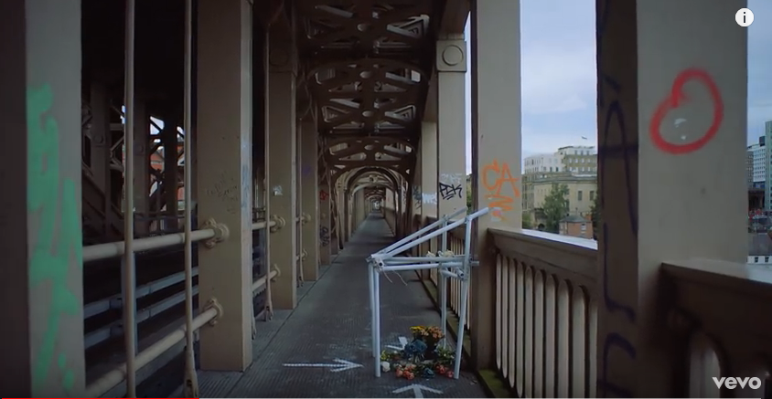
    A shot of an abandoned building links with the social aspects hinted at throughout the song, such as; deprived, broken down areas of society.  The mise-en-scene shows white arrows pointing to a memorial with flowers, creating a strong focal point. The colour of the flowers links to graffiti above.  The camera tracks back to reveal a red graffiti heart showing the memorial is about love and not death.
    Following is a wide angle shot of a Lesbian couple sat centre frame. This shot is making a social comment about same sex love, showing that it is still hard even though you’re not a heterosexual couple.
    Linking to the narrative of the video. The couple are wearing costumes that contrast against the dark background, very much like the first shot of the artist singing into the camera.
    A montage of both gay and straight couples are shown through long shots, medium shots and are stood centre frame, as the chorus is played. This heavily links with the narrative and concept of the video. Behind each couple is a different location. For the straight couple they are seen sat on a urban city rooftop. The lesbian couple are seen sat on a rocky beach, looking at each other. In the gay couples shot, they are in a room, hugging each other. The artist being one of the gay couple creates a link with his personal life.

    As the lyrics say "everytime you hurt me the less that I cry" the shot cuts to a coloured man crying in a boxing ring. Making a social comment about the difficulties of love and race.


    The shot cuts from the boxer to a dark natural light medium shot of a the back of a teenager looking across the sea.


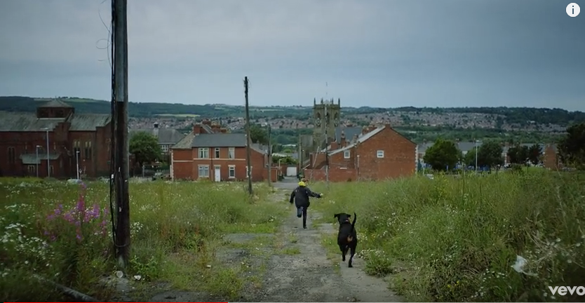
    Then cutting to a shot with a chilld running through a field with a dog. This montage of shots develps the concept aspect of life getting harder as you grow up.


    A picture of an elderly grandparent is seen as the focal point of this shot. The shot then pans back, showing a family upset. This links the lyrics to the music video as the woman in the photo died and they are saying goodbye.


    A extreme long shot of children playing in their school uniform helps follow the concept of life being easy as a child.


    This medium close up is very effective as it shows dark lighting but also links well through synergy as the lighing is the same colour as the gabling machine prop in the background.


    A shot of a woman with her back to a man is very effective as it shows heartbreak and lifes struggles. This shot symblises the narrative and concept of the song.


    This research has helped my understanding when annotating and analysng lyrics to match with the visuals.


    How This Research has Influenced my Planning and Creativity


    1. Lighting - I like the way the props lighting effects the lghting for the entire shot.
                       - I now understand that dull natural lighting creates a mood/atmosphere for the entirety of  the music video.

    2. I like how emotions are shown in different ways. For example, Back turned, Crying, Dark clothing, lighting.

    3. I now know I need to use specific lighting to create a certain mood throughout the video.


    Research: Logos

    There are a variety of logos already used.


    Most include a sign linked to music, Eg; a microphone


    Sony have a very simple red swish of a paintbrush.


    Many logos include musical notes.


    I quite like this one as it is very simple and changed colour, putting more emphasis on the word "tune".


    These two logos are very interesing, the image of a bee symbolises not only links to the name of the company but implies fun and summertime. The image of fire and the disk is eyecatching and suggests a liveliness and an energy to the company.


    How Has This Research Influenced My Planning:

    1. Needs to be eyecatching
    2. Reflect the name
    3. Needs to be symbolic
    4. Needs to suggest something youthful and lively


    Tuesday, 12 September 2017

    Research: TA Research 3 (Group Post)


    Check this out on Chirbit


    We conducted a focus group in order to see how our ideas matched to our song, locations and props. In general we felt that this went very well and that our focus group understood what we were trying to perceive. However, the TA saw certain deeper meanings that we hadn't considered. An idea that we picked out from our focus group is on one of our pictures on the photo board is our artist behind a metal fence. We didn't really take into consideration a meaning behind the shot however, a member in our focus group came up with the idea that the metal fence idea could represent restrictions in society. In order to do this we need to go away and think about if we could incorporate that especially as we liked the idea a lot. It also made us realise that there is more than one concept to our video.


    How this has influenced my creativity and planning


    1. There are so many meanings behind our video that one member of our audience will interpret our video differently to another. This means that there is no right or wrong answer.
    2. We need to discuss different angles we could take our music video in concept
    3. We need to pick out brighter costumes for the end of the music video to show peace and love.

    My Note to the Moderator:

    Welcome to my A2 G325 blog I am Alexander Sherratt, a student from Brigg Sixth Form. I have tried to show my journey from my initial ideas t...